
A review of the redesigned Outlook
Do you use Outlook every single day? I do! That’s why I’m excited to learn about the new, redesigned Outlook that Microsoft is rolling out. Don’t worry – your favorite app won’t change overnight – you will be in control of the switch.
Microsoft has announced something called “Coming Soon” to Outlook for Windows, a toggle switch to give users the choice to try out major upcoming updates.
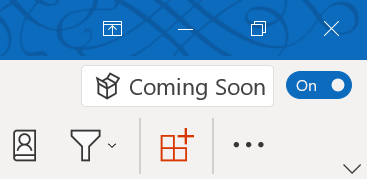
“Coming Soon” toggle switch
The feature is currently being rolled out to users who want to be the first to try new things that are part of the “Insiders program” and soon it will be available for those in the “Monthly Channel (Targeted)”. The beauty with the “opt-in toggle” is that it allows users to try out the new design – with the ability to switch back to the classic layout if desired! So, what can you expect if you switch on the toggle? Let me tell you!
A cleaner, easier to use interface
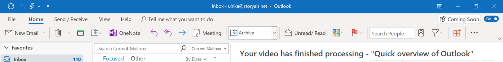
The new design of the menu bar (so-called “Ribbon”) follows a simple design with a single row of icons. Even though it makes it less cluttered, it can take a while getting used to due to the redesigned icons and the text being next to the icon – instead of underneath as it has been for years. Since most users don’t use all the commands available, Microsoft has stowed a lot of them away. Luckily, you can easily add a command if there something you are missing. I, for instance, am a frequent user of OneNote so I could easily “Pin” the “Send to OneNote” button to the ribbon. Even if I resize Outlook, it adapts to make sure my “Send to OneNote” command is still in place.
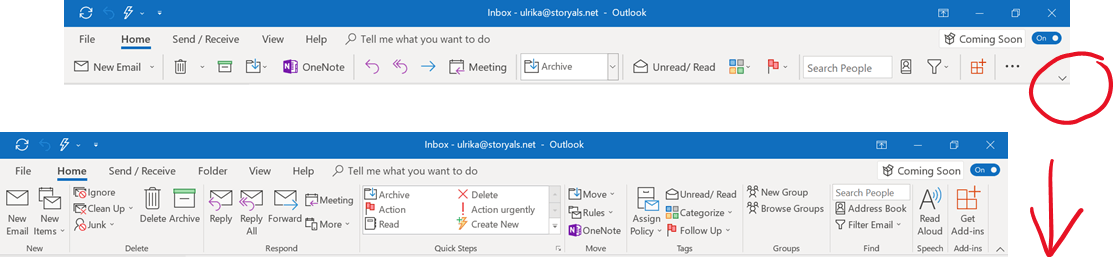
The new Simplified Ribbon

The Classic Ribbon
If you prefer to see all the commands, you can expand the Simplified Ribbon by clicking the arrow down icon.
More focus on what’s important
The message list hasn’t changed much – just a few minor changes to help you focus on what’s most important A few of them include, sender’s names are now in bold, flagged messages are highlighted with a light yellow background, message subjects are more pronounced and there is more place for email content as the header now takes up less space than before. Slight changes of fonts and icons have also been introduced in the reading pane to make it easier to quickly skim through emails.
 Redesigned message list and reading pane
The most frequently used actions like Reply, Accept and Forward have now also been added to the body of the message to make them easier to find.
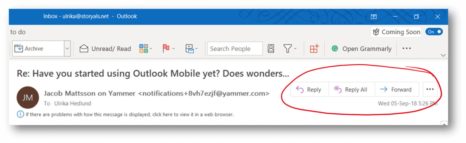
The Reply, Reply All and Forward buttons are now easy to view
Booking meetings made easier
The Meeting window has a cleaner interface with a new “Title” section at the top to input the subject of the meeting, two separate boxes to easily fill out the Required and Optional attendees for the meeting, and a Room finder button to quickly choose an available room including suggested times.
 New meeting request window
Summary
Overall, the redesigned Outlook is mostly that – a redesign of the user interface, without a lot of added or removed functionality. I believe it’s a good update, especially since a lot of younger people who are used to less sophisticated email applications find the current layout of Outlook too complex. Nevertheless, even with the redesign, Outlook still caters to those of us (like me) who really like the power tools that Outlook provides (like Quick Steps, Send to OneNote, etc.).
There are a few things that I had hoped to see in this redesign, especially in terms of ensuring consistency between Outlook for Windows, Outlook Online and Outlook mobile. One of them is the ability to pin messages to the top in your folder list (this ability is currently there in Outlook Online). The other thing I would like to see is a “Schedule” button (or “Action” as I prefer to call it). Just as you archive messages and move them to an “Archive” folder, I encourage users to have an “Action” button that you press to move messages out of your folder list into an “Action” folder. You have this ability by default in the Outlook Mobile app, where you can just swipe to the right to move a message to a Schedule/Action folder (and swipe to the left to archive). You can, of course, accomplish this by creating your own button via Quick Steps, but this is more advanced, and I don’t think a lot of users do it.
If you’d like to learn more about the redesign of Outlook, you can check out Microsoft’s YouTube video here. Also, if you would like to learn how to use email more effectively using Outlook across devices, sign up for a membership here on businessproductivity.com, or subscribe to the topic “Take control of your inbox” on Storyals.com.
-By Ulrika Hedlund (Founder of Business Productivity)